Posted by Srishti Mitra
https://www.yankodesign.com/2026/05/06/9-best-travel-gadgets-gear-that-make-summer-2026-actually-worth-packing-for/?utm_source=rss&utm_medium=rss&utm_campaign=9-best-travel-gadgets-gear-that-make-summer-2026-actually-worth-packing-for
https://www.yankodesign.com/?p=622514
The best travel packing lists have always been exercises in subtraction. What earns its weight. What survives a summer of trains, guesthouses, and long airport mornings? The objects that endure are the ones designed with enough intention that they feel better used than new. This year, that edit has gotten easier. A handful of products have arrived that understand travel not as a logistics problem but as a mode of living worth designing for.
There is a particular pleasure in a bag that weighs nothing and contains everything you need. The nine objects below represent that standard. They range from a pressure brewer disguised as a travel mug to a titanium pen that barely exists. What they share is the belief that good design removes friction from the day rather than adding features to it. Pack all nine, and you will still have room for a change of clothes.
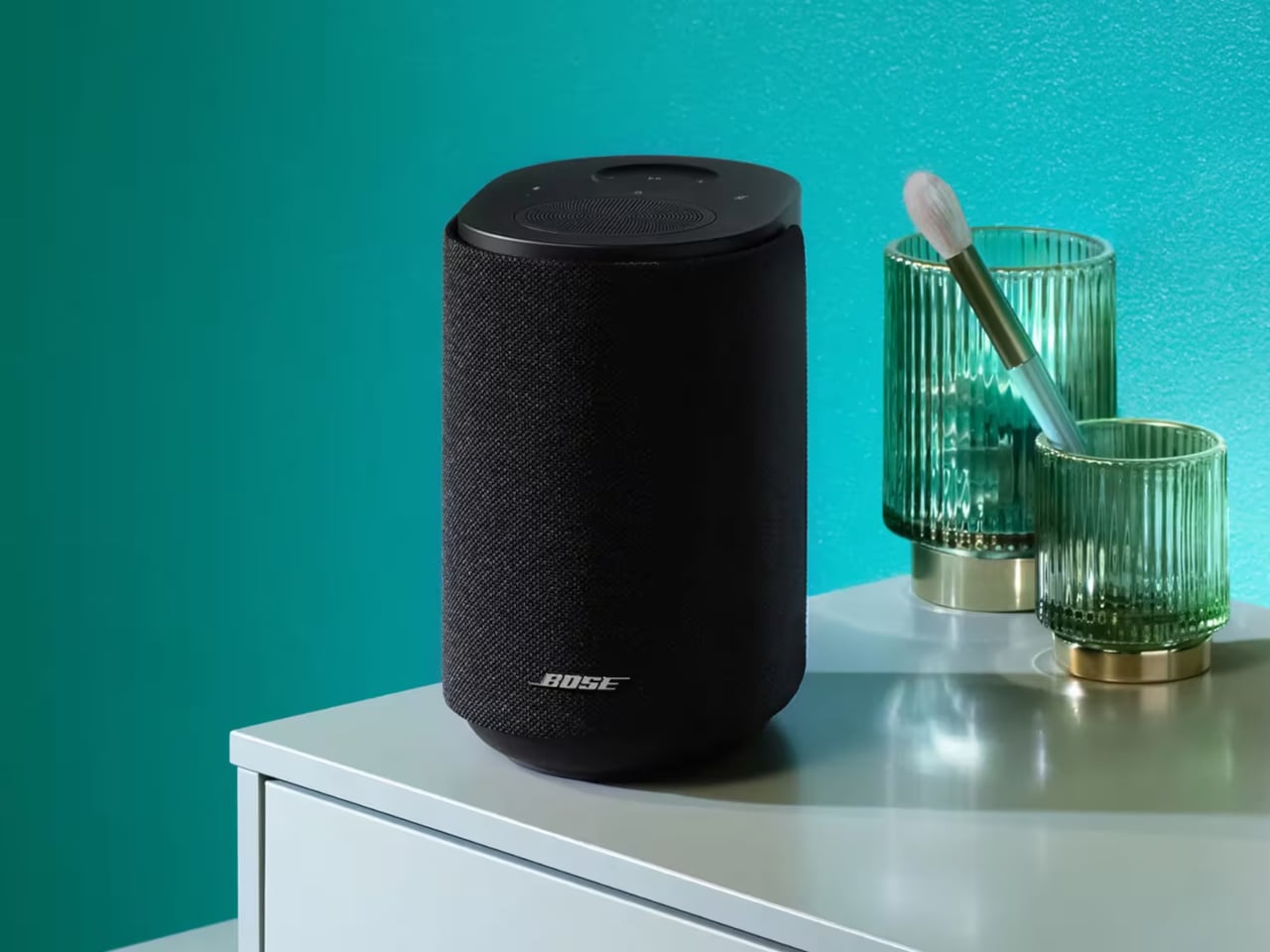
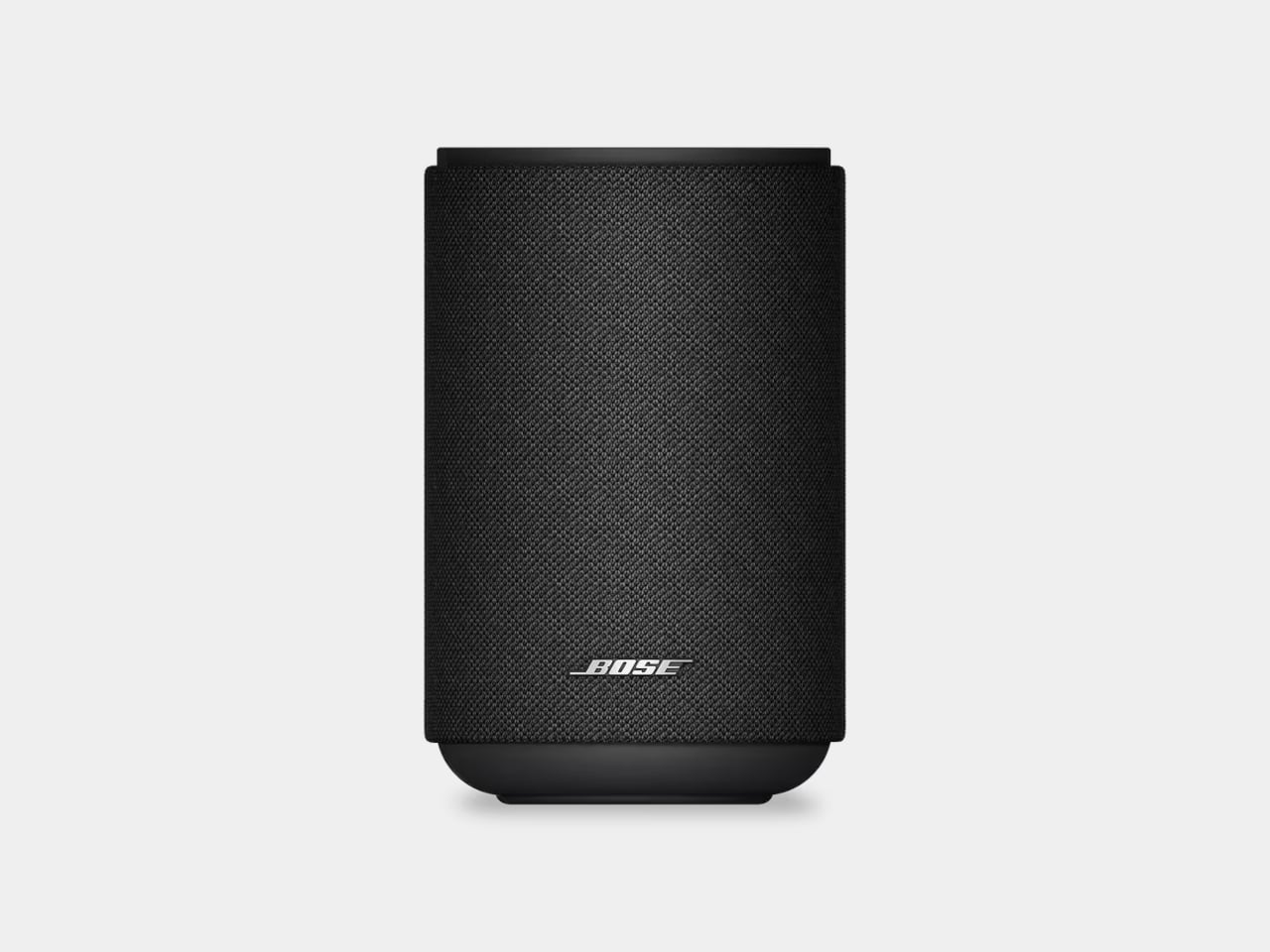
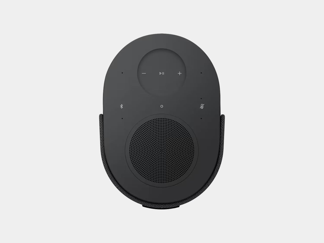
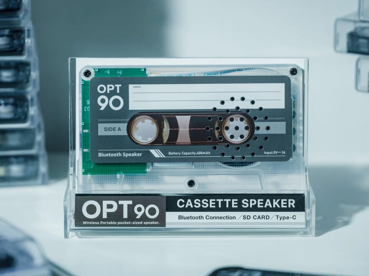
1. Side A Cassette Speaker
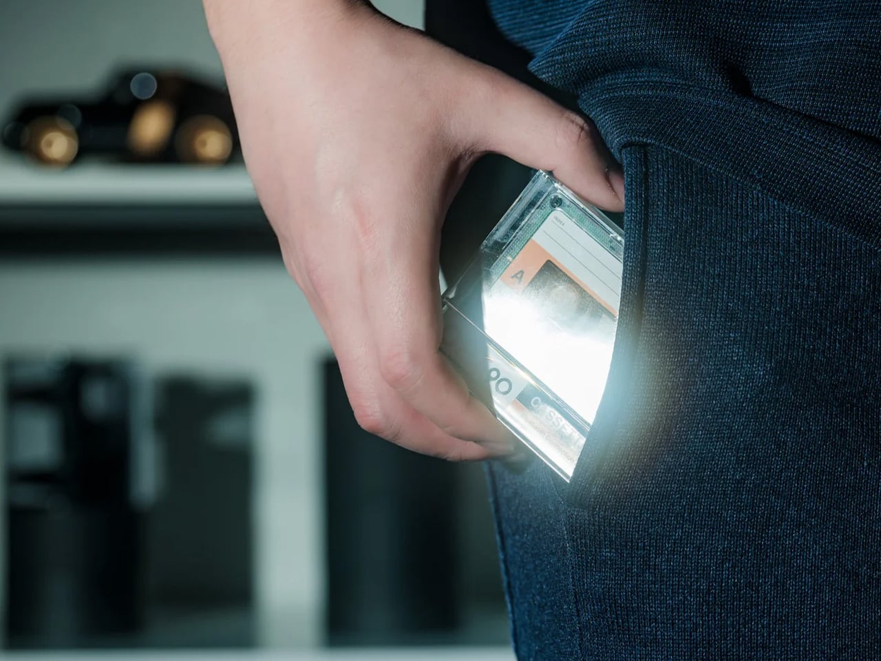
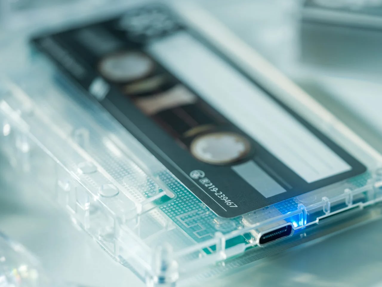
The Side A is a cassette tape that plays music, which makes it one of the quietest pieces of industrial design to land on a travel shelf in years. The form is exact: the dimensions of a 1970s compact cassette, the weight of an afterthought, and a sound quality that has no business coming from something this small. It fits in the coin pocket of your jeans, clips to a bag strap, and starts a conversation with everyone who notices it in a hostel common room or on a beach towel.
For travel, the emotional dimension matters as much as the functional one. The Side A is the object you pull out at a guesthouse in Lisbon or a rented apartment in Kyoto and place on a windowsill while you unpack. It signals something about the kind of traveler you are before you say a word. It runs wirelessly via Bluetooth and charges via USB-C, so the retro aesthetic is purely visual. The ritual of pressing play on something shaped like a tape deck turns any room temporarily yours.
Click Here to Buy Now: $49.00
What We Like
- The cassette form factor fits in places no other speaker can, including pockets, passport holders, and the side mesh of a water bottle sleeve.
- Wireless Bluetooth and USB-C charging mean the vintage look carries none of the vintage inconvenience.
What We Dislike
- Sound projection is directional and intimate rather than room-filling, which large outdoor spaces tend to expose.
- The compact size means battery life is capped shorter than bulkier travel speakers in the same price range.
2. MokaMax
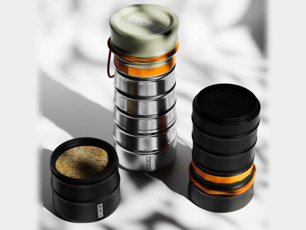
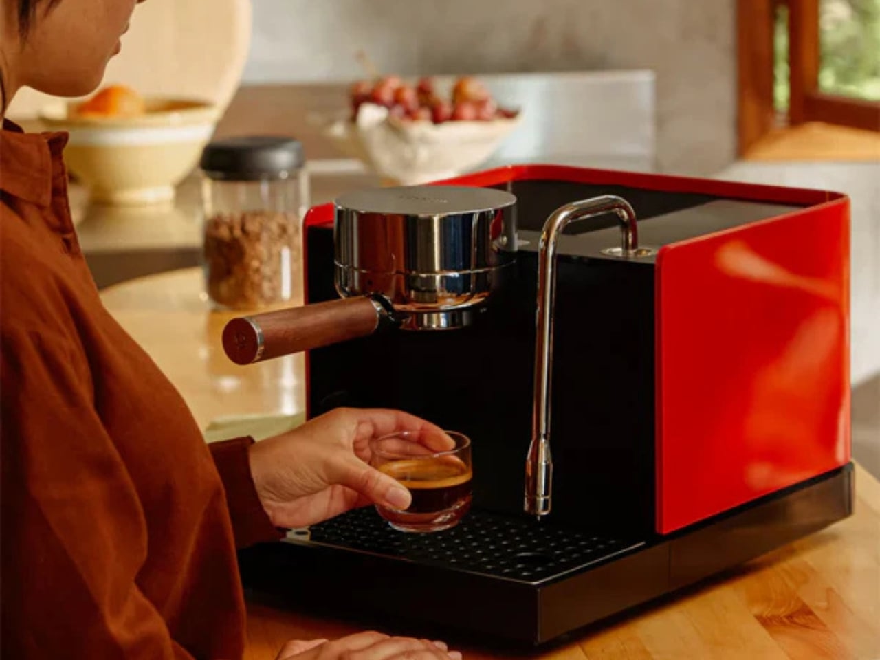
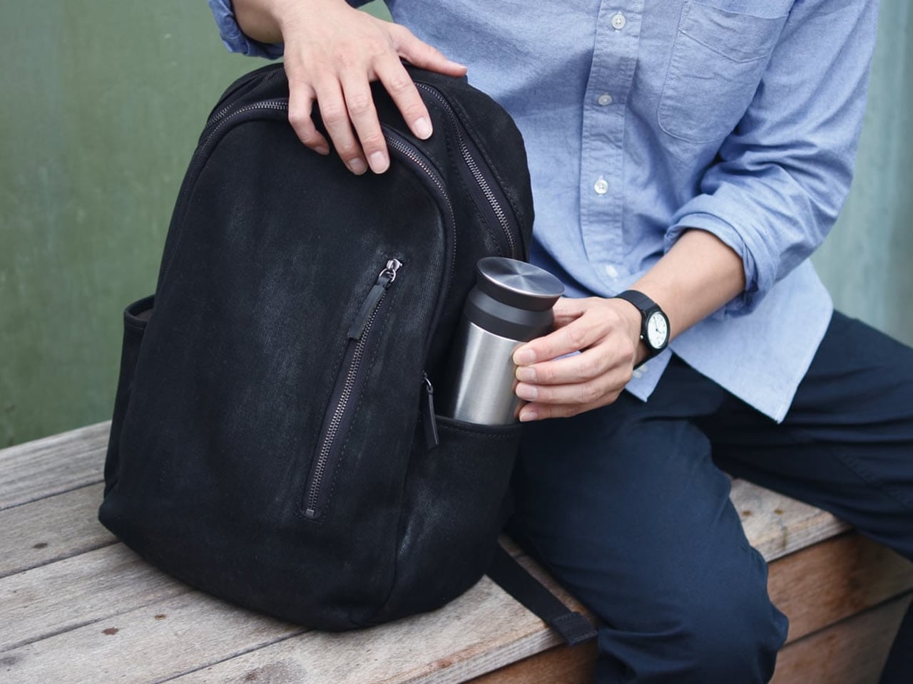
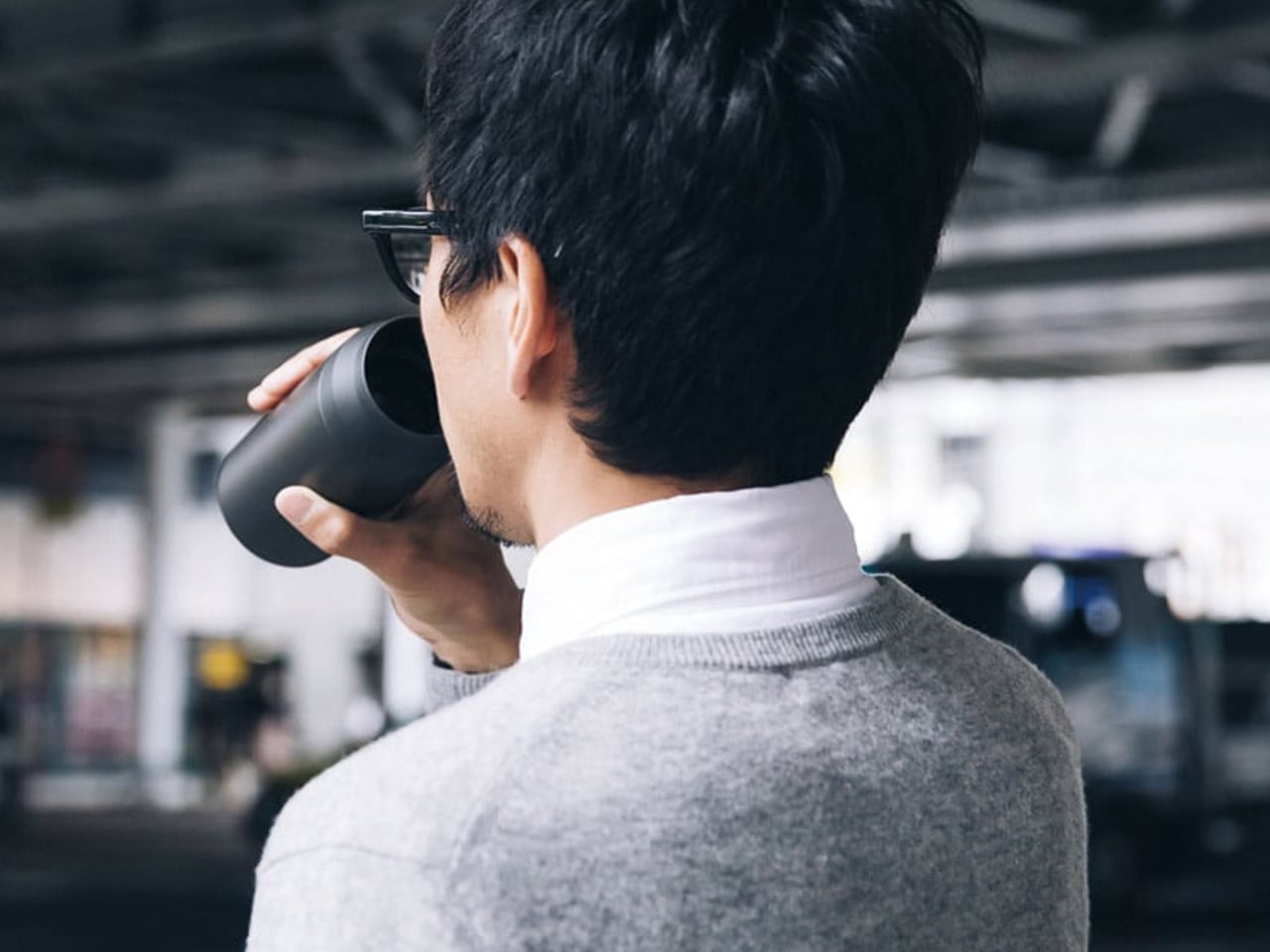
The hotel room coffee situation has not improved. The MokaMax accepts this and brings its own solution: a ridged stainless steel travel mug that contains a full pressure brewer inside its body. You fill the chamber, add grounds, apply pressure through the integrated mechanism, and have something approximating an espresso in under three minutes using nothing but boiling water from the kettle on the credenza. It is a singular piece of design that treats a genuine travel problem with the seriousness it deserves.
The ridged stainless exterior gives it a profile that belongs on the shelf of a Scandinavian kitchenware shop rather than in a carry-on bag. It travels as a sealed container with no separate parts to lose across time zones. The lid doubles as a cup. The whole thing weighs 400 grams fully loaded and fits in the front pocket of most travel backpacks. For coffee people who have tried every in-room alternative and arrived at the same disappointing conclusion every morning, this ends the conversation.
What We Like
- The integrated brewer and mug in a single sealed body means no separate components, no loose parts, and no compromises across a summer of movement.
- The ridged stainless exterior is visually distinctive enough to qualify as an object worth owning well beyond its function.
What We Dislike
- Cleaning the pressure chamber on the road requires access to a proper sink and a few spare minutes that airport transit rarely provides.
- The 400g weight, while justified, is noticeable in a carry-on where every gram has already been negotiated.
3. AirTag Carabiner
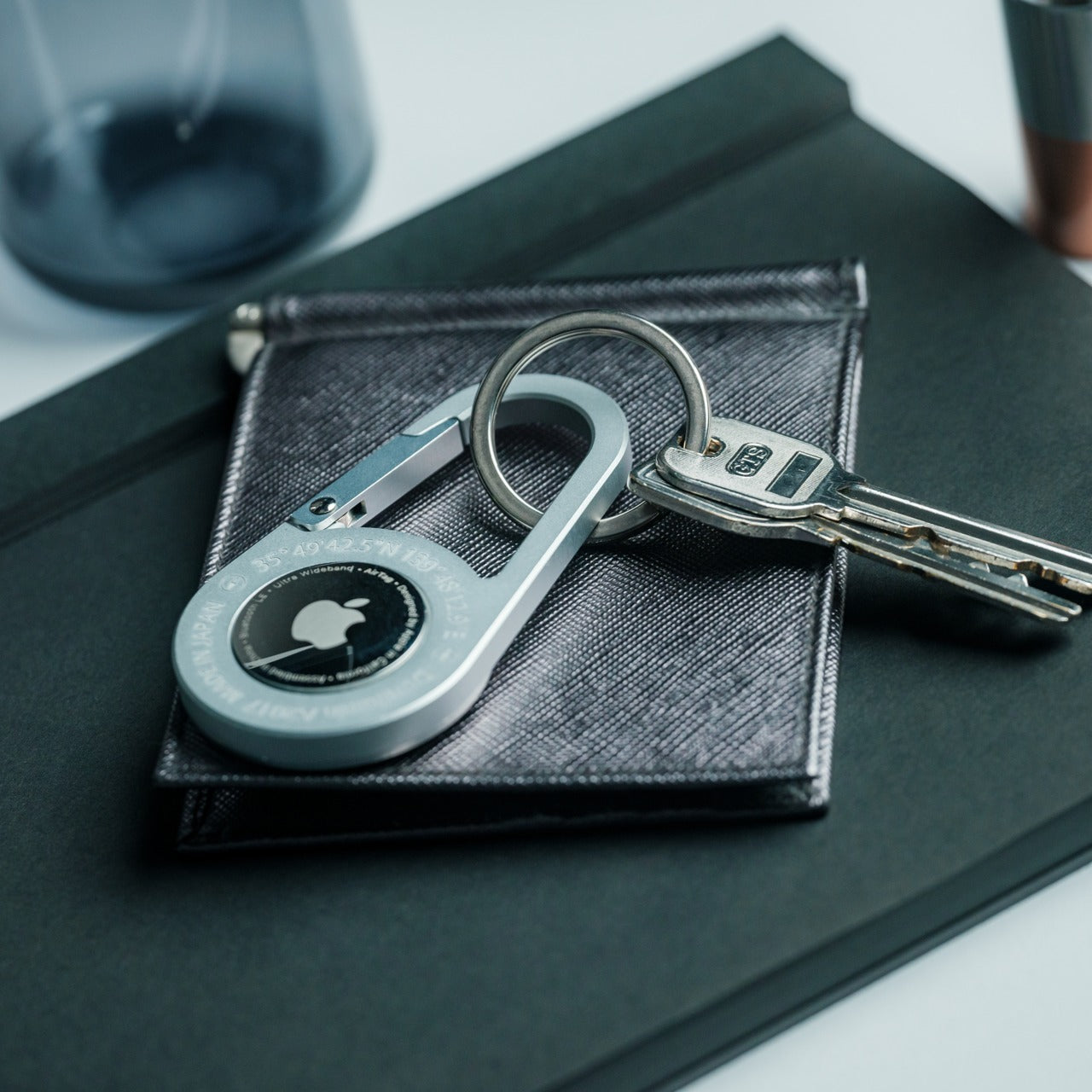
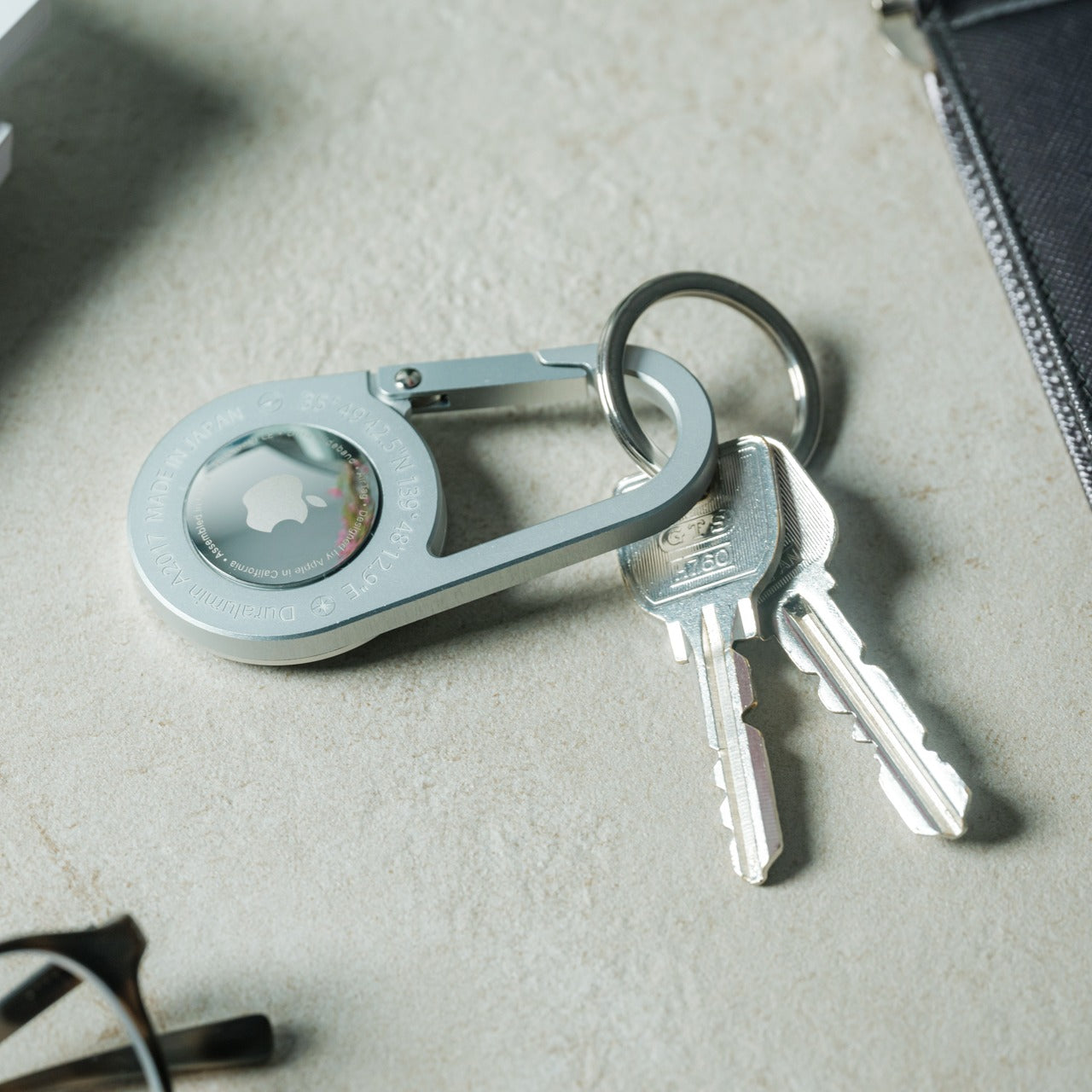
The AirTag Carabiner treats Apple’s tracking disc the way a good frame treats a painting: it makes the object inside worth looking at. Machined aluminum, a clean gate mechanism, and a profile that clips to bag straps, belt loops, and zipper pulls without reading as gear. Most AirTag cases are either cases or carabiners. This one is genuinely both, and the design is considered enough that you clip it on and forget it exists entirely until the moment you need it.
For travel, the peace of mind is architectural. You clip one to your checked bag and one to your day pack, and the anxiety of watching a baggage carousel empty while your luggage doesn’t arrive shifts from dread to information. The form is compact enough that it adds nothing to the weight profile of a bag. The aluminum patinas naturally over months of use into something that looks earned rather than bought. It is the category of object whose value you only understand the first time it does its job.
Click Here to Buy Now: $149.00
What We Like
- The machined aluminum gate and clean profile make it one of the few AirTag carriers that genuinely improve the look of whatever bag it attaches to.
- The combination of carabiner utility and tracking function eliminates the need for a separate clip and a separate case simultaneously.
What We Dislike
- The AirTag itself is sold separately, which means the full experience requires an additional purchase; most listings bury this in fine print.
- Aluminum gates can feel stiff in cold weather, and the opening requires two hands during the first weeks of regular use.
4. Comes
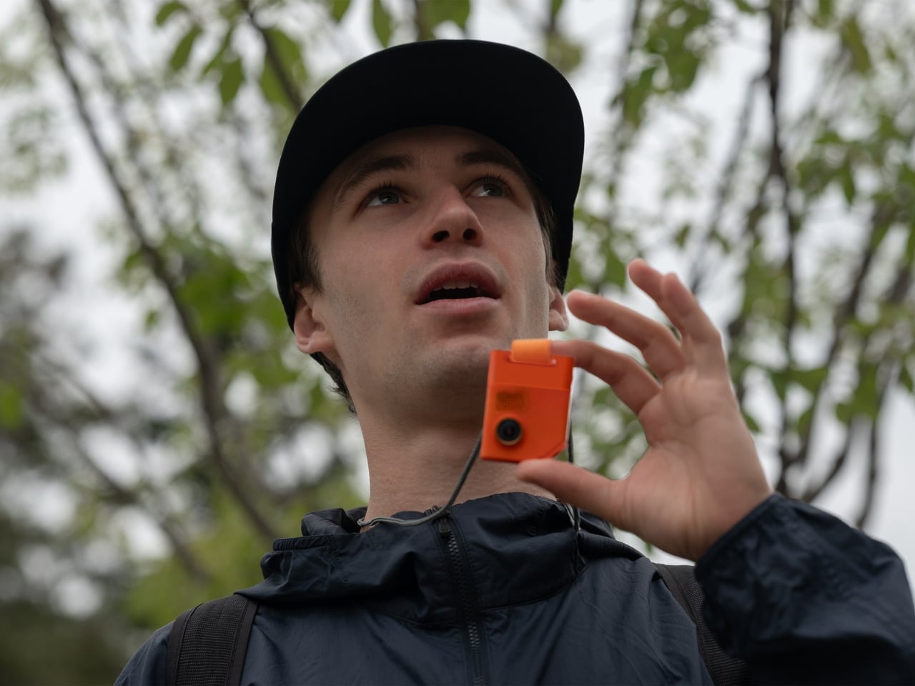

Siwoo Kim’s Comes is a small AI companion device designed specifically for solo travel, and the premise is more considered than it sounds. It sits in your palm, connects to your phone, and acts as a conversational layer between you and unfamiliar places: translating menus, suggesting detours, and responding to the low-stakes questions that feel embarrassing to search for in public. The design is rounded and quiet, built to stay in a pocket rather than demand a wrist, a screen, or a face to look at.
What makes Comes worth including in any honest travel list is what it refuses to do. It is not a phone. It has no screen. It does not try to replace anything except the particular loneliness of standing in a new city without anyone to ask. For solo travelers who find the performance of looking confident in unfamiliar places genuinely tiring, Comes offers a private layer of support without the social cost of visibly consulting a device. It turns navigation into conversation, which is a different kind of travel entirely.
What We Like
- The screenless, pocket-sized form means it assists without demanding attention, which is the rarest quality in any device designed for travel.
- The AI layer is built specifically for travel contexts, making it meaningfully more useful than a repurposed general-purpose assistant.
What We Dislike
- Connectivity depends entirely on your phone’s data plan, which in rural or international contexts can make the experience inconsistent.
- The concept is stronger than the current feature set, and early adopters will encounter limits that future firmware will eventually address.
5. Kinto Travel Tumbler
KINTO has been making drinkware in Japan since 1972, and the Travel Tumbler is the product that explains why the brand has a following among people who pay attention to objects. Matte stainless steel, a one-handed screw lid with a silicone seal, and an opening wide enough to drink from without tipping your head back. There is no rubber gasket on the exterior. No logo beyond a debossed stamp. No color options are engineered to attract attention. It disappears into your morning routine and becomes difficult to travel without.
The 500ml capacity is the most considered part of the design. It is enough for a double espresso topped with hot water, or a full cup of whatever the guesthouse kitchen offers, without being the oversized vessel that forces you to drink fast or carry heavy. It keeps liquids at a temperature for six hours in either direction. For a summer of early trains and long afternoons in cities you are still learning, the Kinto becomes the object you reach for more often than any other in your bag.
What We Like
- The matte stainless exterior and restrained detailing place it closer to Japanese tableware than outdoor gear, which is a genuine category distinction.
- The 500ml capacity hits the precise middle ground between espresso-sized and inconveniently large for everyday carry.
What We Dislike
- The screw lid takes slightly longer to open than a flip-top, which becomes apparent when you are holding a tray and a boarding pass simultaneously.
- The matte finish marks with fingerprints in warmer climates and requires more frequent wiping than a polished surface would.
6. Casabeam Everyday Flashlight
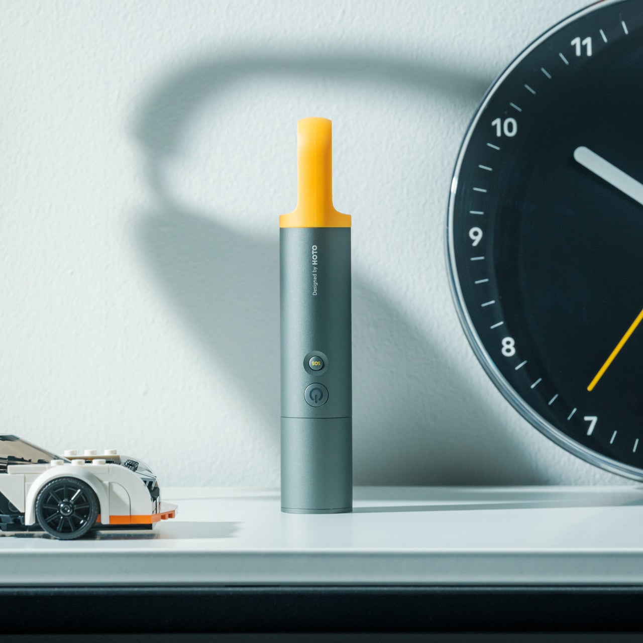

The Casabeam occupies the specific design territory between a tool and an object worth keeping on a desk. The body is machined to a clean cylindrical profile with a pocket clip that doubles as a satisfying fidget mechanism, and the beam output is serious enough for actual use without the tactical overdesign that plagues most EDC lights. It charges via USB-C and remembers its last mode, which sounds minor until you have spent thirty seconds cycling through strobe mode in a dark guesthouse corridor at 2 am.
Travel reveals how often you need a light that is not your phone. Cobblestone streets with broken lamp posts. Power cuts in cheaper accommodation. Reading in a top bunk without waking the rest of the room. The Casabeam handles all of it from a body that fits alongside a pen without adding bulk. The light quality is warm enough to be comfortable and bright enough to be useful. It earns more appreciation the longer you carry it, because it keeps solving problems you had quietly given up on solving.
Click Here to Buy Now: $50.00
What We Like
- USB-C charging and mode memory remove the two most common sources of friction in EDC flashlight ownership entirely.
- The machined cylindrical body is refined enough to sit alongside design objects rather than tools without any visual apology.
What We Dislike
- The warm beam color, while pleasant for ambient use, is less useful for reading text at a distance than a cooler 5000K alternative.
- The pocket clip was clearly designed for trouser pockets rather than shirt pockets, and the thinner fabric requires deliberate re-positioning.
7. CW&T Pen Type-C Ultra — gnuhr Edition
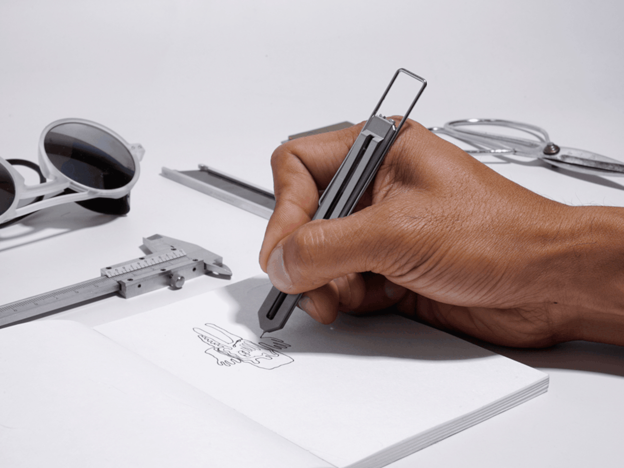

CW&T is a small New York studio that produces objects in limited runs for people who pay close attention to manufacturing. The Pen Type-C Ultra gnuhr Edition is Grade 5 titanium, hollowed and precision-milled to a skeletal profile that removes every gram that does not need to exist. It weighs almost nothing. It looks like it belongs next to aerospace hardware in a design archive. It takes a standard ballpoint refill and writes exactly as a pen should, with no drama and no compromise in either direction.
Traveling with this pen converts the act of writing into something you notice. Filling in a form at a hotel desk, signing a restaurant receipt, sketching a street corner in a notebook: these are the moments when an object of this quality distinguishes itself from everything else in your pocket. It does not perform its material. It simply is the material, in a form tight enough to disappear on a keychain or in the spine of a notebook. For a summer of movement, something is clarifying about carrying a pen that will outlast every passport you own.
What We Like
- Grade 5 titanium construction and skeletal precision milling place this in a different category from every other writing instrument at any price point.
- Standard ballpoint refill compatibility means the most beautifully made pen you own is also the easiest to maintain anywhere in the world.
What We Dislike
- The skeletal body offers minimal grip surface, which becomes fatiguing during longer writing sessions on bumpy transport.
- CW&T produces in limited runs, so availability can disappear without notice, and restock timelines are rarely predictable.
8. PROOF Wallet
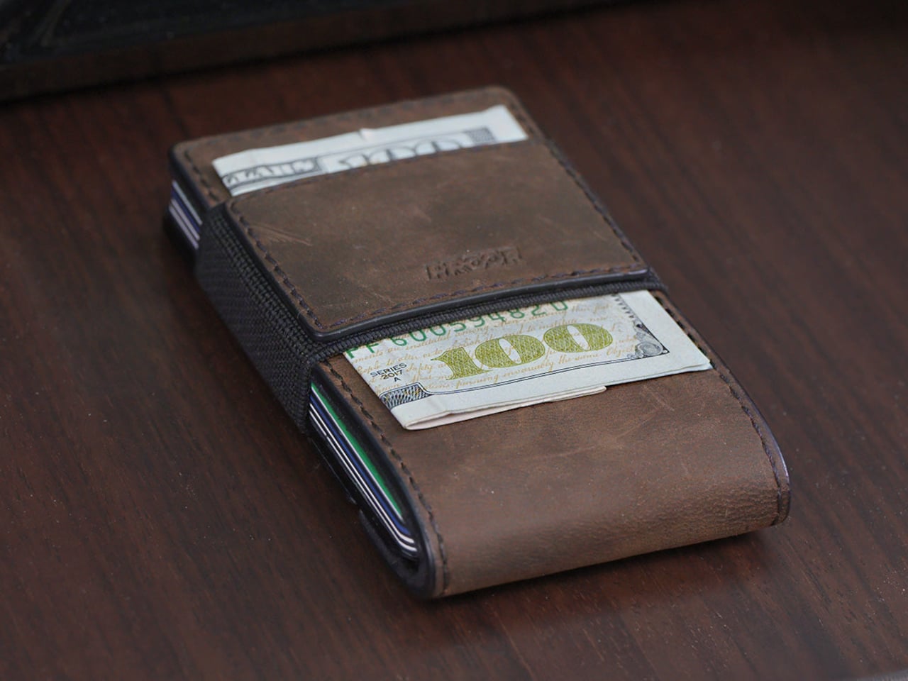
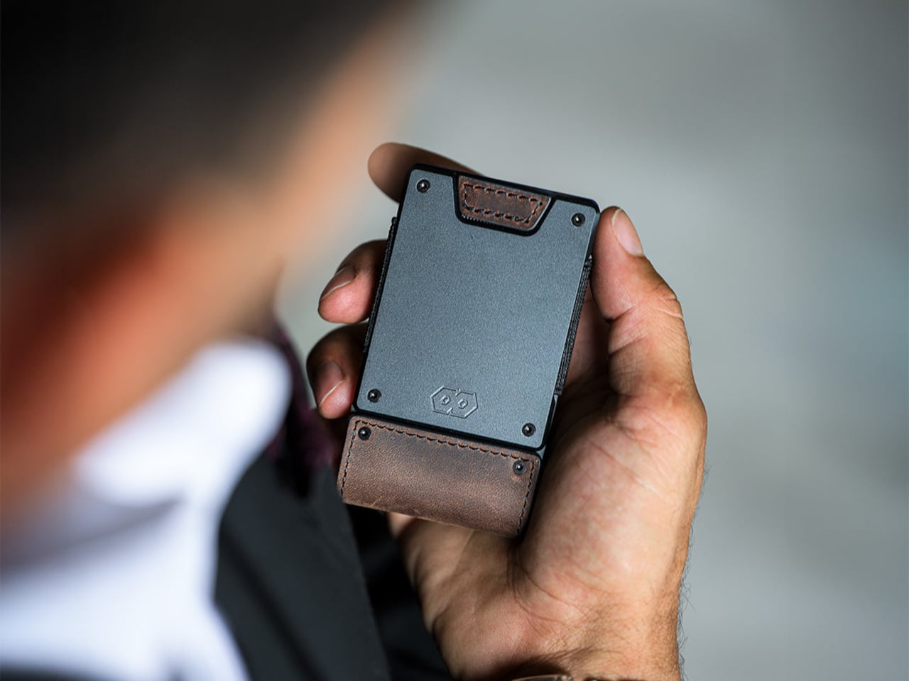
The PROOF Founder pairs an aerospace-grade aluminum plate with top-grain leather and a wide elastic strap in a form that reads as professional rather than tactical. Most minimalist wallets solve their problem by holding less. This one solves it by holding more without growing. The Founder handles anywhere from one to twenty-five cards, with the elastic strap compressing the stack and the leather wrap keeping it contained. It sits flat in a jacket pocket and does not announce itself, which, for travel, where your wallet becomes a daily tool rather than a background object, is the entire point.
The aluminum plate is the structural element that separates this from fabric-only alternatives: it prevents the flex and collapse that plagues elastic wallets after months of use and creates a satisfying resistance when fanning through cards. The leather wrap patinas over a summer into something that looks considered rather than worn. There is no branding on the exterior beyond the material itself. For the kind of traveler who finds the Ridge wallet slightly too aggressive in a formal setting, the Founder is the obvious alternative that nobody else at the table will recognize.
What We Like
- Aerospace aluminum structure paired with top-grain leather produces a material combination that improves with use rather than degrading with it.
- The one-to-twenty-five card capacity range makes it genuinely flexible across the context shifts that define summer travel without structural compromise.
What We Dislike
- The elastic strap shows its age before the leather or aluminum does, and replacement options require contacting the brand directly.
- The profile, while slim, is wider than card-only holders, which feels unnecessary on short day trips when you carry two cards and nothing else.
9. Traveler’s Notebook
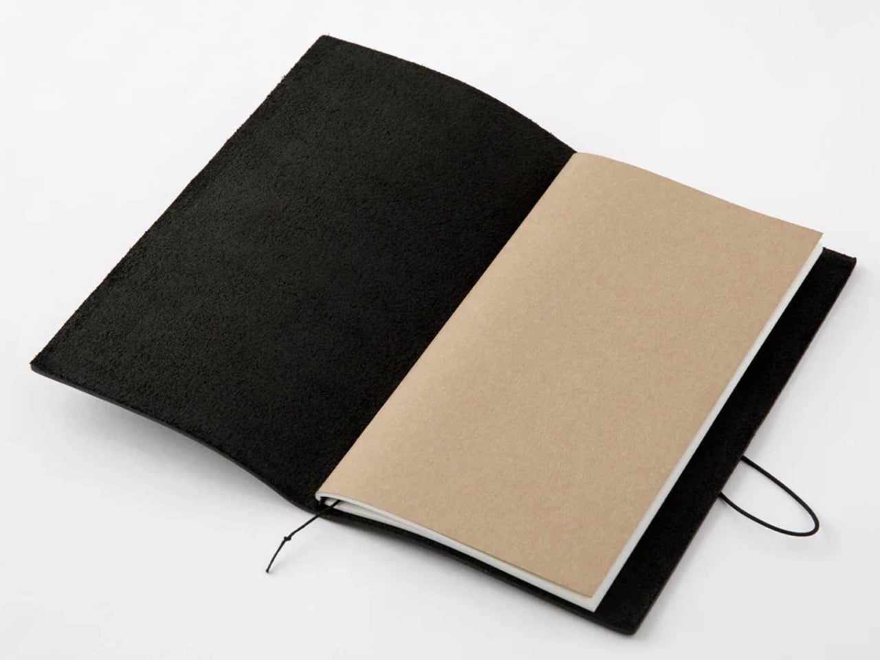
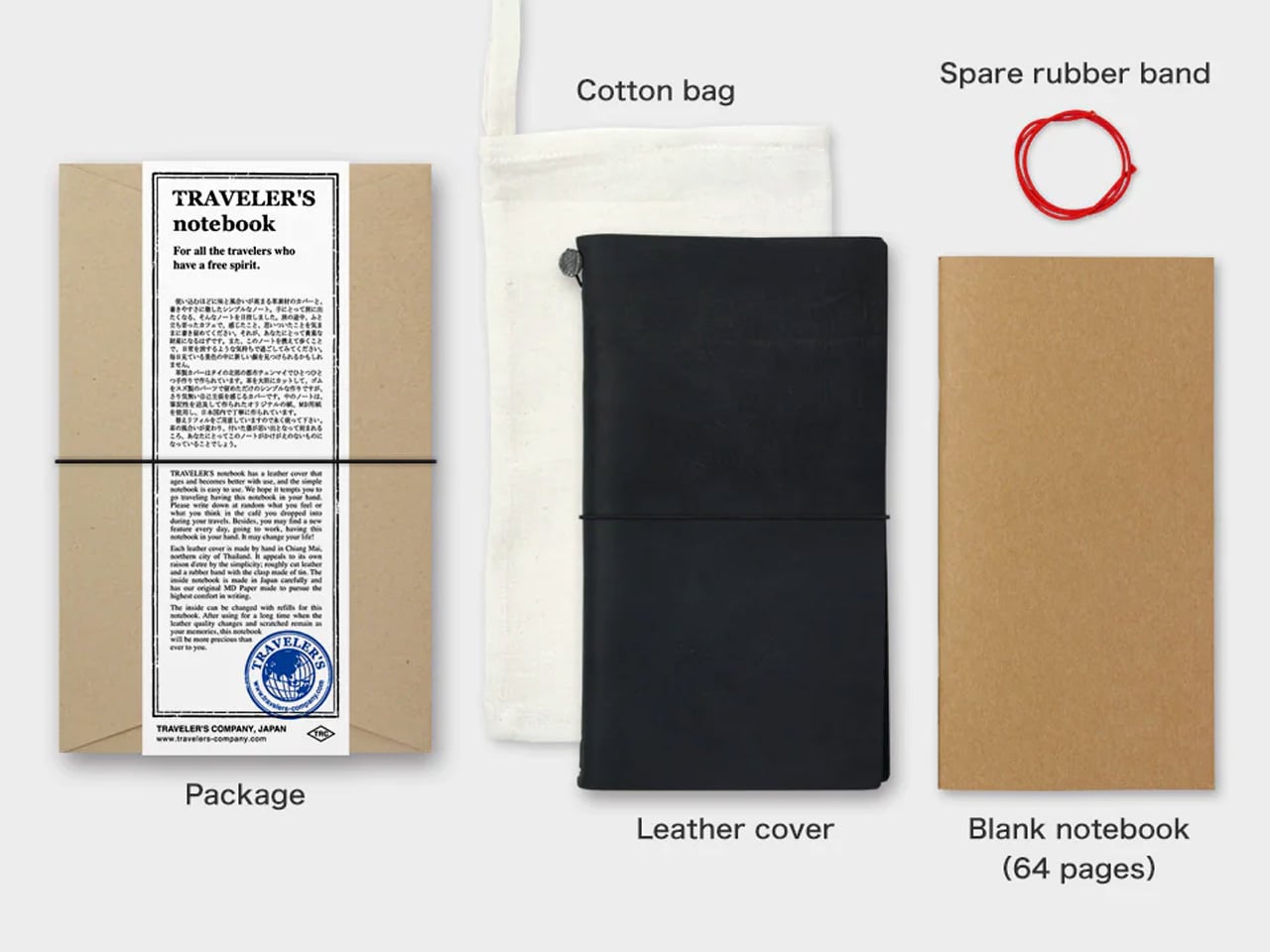
The Traveler’s Notebook has been in continuous production since 2006 and has changed almost nothing about itself, which is as strong an endorsement as any product can receive. The black edition is oiled buffalo leather stretched over a brass clip and elastic cord, aging into something that looks genuinely lived-in after a single trip. The passport size fits a shirt pocket. The paper is cream-colored, fountain-pen-friendly MD stock that resists bleed-through with quiet success. The inside becomes whatever you need it to be: journal, sketchpad, receipt keeper, boarding pass sleeve.
In a list built partly around technology and connectivity, the Traveler’s Notebook earns its place by doing nothing digital. It is the object that captures the parts of a trip that photographs miss: the light on a piazza at seven in the morning, the menu item you want to remember, the address someone wrote down for you on a napkin now tucked into the inner fold. Travel writing done by hand in a book that costs less than a meal has a particular relationship to memory that no app has yet replaced. This is the pocket-sized argument for why.
What We Like
- Oiled buffalo leather and brass clip construction will outlast every phone, charger, and piece of luggage in the bag by a significant margin.
- The refillable insert system means the notebook’s physical character accumulates across years while the interior renews for each new destination.
What We Dislike
- The elastic cord binding requires an initial period of loosening before the inserts sit flat, which new users consistently find frustrating in the first week.
- The narrow passport format can feel constrained for wider handwriting styles, particularly for left-handed writers working on moving transport.
Pack Less. Pay Attention.
Nine objects across nine categories, and the through-line is identical across all of them. Each one was made by someone who asked a specific question about how a thing should work rather than how it should be marketed. That specificity is what makes a bag lighter, a morning better, and a new city feel less like a problem to manage and more like the reason you left home in the first place.
The best travel gear does not make travel easier in the way a better suitcase wheel makes transport easier. It makes travel richer in the way a good book makes a long flight disappear. These nine objects will not tell you where to go. They will make you pay closer attention once you get there, which is the only travel advice worth taking.
The post 9 Best Travel Gadgets & Gear That Make Summer 2026 Actually Worth Packing For first appeared on Yanko Design.
https://www.yankodesign.com/2026/05/06/9-best-travel-gadgets-gear-that-make-summer-2026-actually-worth-packing-for/?utm_source=rss&utm_medium=rss&utm_campaign=9-best-travel-gadgets-gear-that-make-summer-2026-actually-worth-packing-for
https://www.yankodesign.com/?p=622514
![[personal profile]](https://www.dreamwidth.org/img/silk/identity/user.png) doniago) wrote2026-05-06 01:48 pm
doniago) wrote2026-05-06 01:48 pm